
Introduction to npphen in R
Authors: Matías Olea, José A. Lastra, Roberto O. Chávez (Dec 20, 2024)
Preamble
The R package npphen has been developed primarily to enable land surface phenology reconstruction and extreme anomaly detection by using remote sensing time series. Nevertheless, npphen includes functions to analyze any type of numerical time series. Examples of remote sensing time series that can be tackled using npphen are differents time series (e.g. NDVI, EVI, Temperature, Precipitation, Soil Moisture) from diferents dataset as GIMMS project, the U.S. MODIS Program, Landsat Program the E.S.A. Sentinel 2 Program or the CR2MET products for chilean climate. Examples of numerical time series can be the NPP (Net Primary Productivity) from a FluxNet Tower or the GI (Green Index) from the Phenocams Networks.
In this document we want to facilitate the use of this package by demonstrating in detail what the individual functions do and how they can be applied. For this task we will use a demo dataset of 16-day MODIS Enhanced Vegetation Index (EVI) composites, though generally the package can be used to process a wide range of remotely-sensed products such as Landsat, MODIS, Sentinel-2 or AVHRR.
1 Set up your system
All necessary R packages (such as terra & lubridate) are automatically installed together with npphen by typing and running in an active R session:
| install.packages('npphen') library(npphen) |
| > ?npphen #to get familiar with the avaible functions |
2 Remote sensing data and data pre-procesing
The demo consists of 16-day MODIS EVI composites of Constitucion, a city located in the mediterrean region in Central Chile, were forest has been afected by a extreme forest fire in 2017. All in all we used 491 EVI images obtained from the Aqua satellite (MYD13Q1 product) which have already been ’cleaned’ using the VI Quality Bands.

For this example code, we will use the libraries "npphen", "terra" and "tidyverse".
2.1 Read EVI data and create a multi-temporal raster object
First we read EVI the raster stack using rast() function of terra-package. Therefore, we have to use the CSV-file with the dates of the images.
|
evi <- rast('YourFolder/MYD13Q1_EVI_ts491_sample.tif') |
3. Land surface phenology (LSP) and anomaly detection of numerical vectors
In order to understand how the npphen approach works and what the results look like, we first want to apply the algorithm on the EVI time series of one pixel. We can either use a known cell number, or extract a single pixel by a coordinate with the function extract(), and plot the VI values of each observation. We recommend to repeat the following steps with a couple of different pixels in the dataset, especially if working in a heterogeneous study area. For this code we provide two coordinates, one pixel of a forest plantation, and the other of deciduous forest.
|
xy_1 <- cbind(208567, 6077726) # Coord. of forest plantation serie_1 <- terra::extract(evi, xy_1) %>% as.numeric() |

3.1 Working with numerical vectors (a single pixel): Phen
The function Phen() estimates the annual phenological cycle from a time series of vegetation greenness. It requires the time series as well as the observation dates as numerical vectors. The argument h indicates the geographic hemisphere and is used to define the starting date of the growing season. h=1 if the study area is in the Northern Hemisphere (season starting at January 1st), h=2 if it is in the Southern Hemisphere (season starting at July 1st). The argument frequency Defines the number of samples for the output phenology and must be one of the this: 'daily' giving output vector of length 365, '8-days' giving output vector of length 46 (i.e MOD13Q1 and MYD13Q1), 'monthly' giving output vector of length 12, 'bi-weekly' giving output vector of length 24 (i.e. GIMMS) or '16-days' (default) giving output vector of length 23 (i.e MOD13Q1 or MYD13Q1). rge is a vector containing the minimum and maximum values of the response variable used in the analysis. We suggest the use of theoretically based limits. For example, in the case of MODIS NDVI or EVI, the values range from 0 to 10,000, so rge=c(0,10000). The output is a numerical vector containing the expected value of the vegetation index for each dates which lengths its determined by the argument frequency. This is in fact the expected annual phenology of a standard growing season, reconstructed from all available historical observations.
In this example we will use the EVI time series of the decidous forest.
|
PhenPix <- Phen(x = serie_2, # numeric vector with time series plot(PhenPix, xlab = 'Days of phenological cycle', ylab = 'EVI') |

3.2 Plot of the annual phenology and its RFD: PhenKplot
The function PhenKplot can be used to visualize the reference frequency distribution (RFD) of VI values at different days of the growing seasons. The dark red line is considered the reference VI phenological curve and is the output of the Phen function. This plot illustrates the LSP of the specific pixels in more detail than the simple plot function by also showing how the vegetation index is ranging through time.
|
PhenKplot(x = serie_2, dates = table_dates$date,, h = 2, |

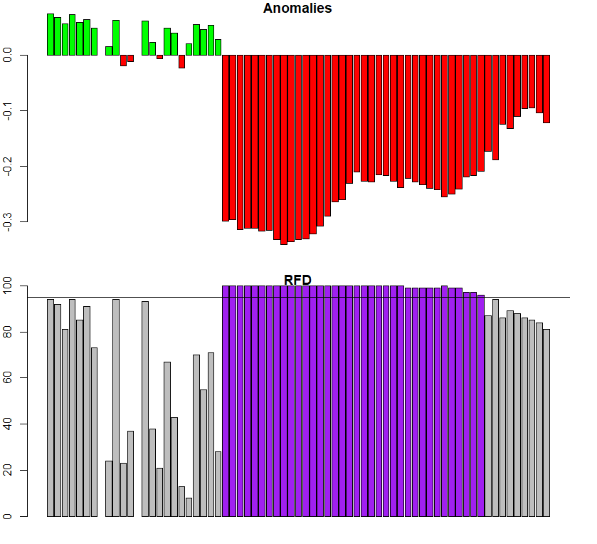
3.3 Anomaly detection using ExtremeAnom
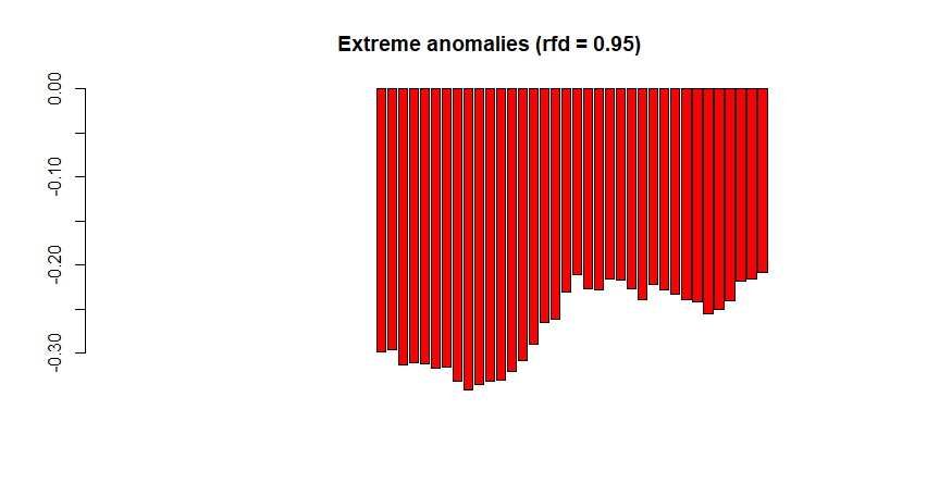
When our goal is to not only reconstruct the land surface phenology but to map vegetation changes (e.g. the impact of insect infestations on the forest structure), we can use the function ExtremeAnom(). It will first estimate the regular phenological cycle using a reference period (just as Phen does), and then calculate the anomalies of the observed phenology of a given date from the reference curve (check the red curve in PhenKplot). Therefore, the additional arguments refp and anop define the reference period and the anomaly calculation period, respectively. The new argument output defines the output values. 'both' (default) returns both anomalies and rfd position together as a single numeric vector. The output lenght of 'both' is two times the lenght of the argument anop, so if anop is c(1:10), the output lenght will be 20L. The option 'anomalies' returns only anomalies, 'rfd' returns only rfd values (how extreme the anomalies are) and 'clean' returns only extreme anomalies, i.e. anomalies at which a given rfd is overpass (e.g. 0.90). This critical threshold is set by the users using the rfd argument. And finally, rfd is an argument that only applies when the argument output = 'clean'. It defines the percentile (from 0 to 0.99) of the reference frequency distribution, for which anomalies are not flagged as extreme anomalies. For example, if rfd = 0.90 only anomalies falling outside the '0.90 rfd' (default value) will be flagged as extreme anomalies while the rest will be neglected (NA values).
For the next example, we will use the plantation time series with the fire trace in 2017. For the reference period (refp) we considered 2000-2010 (before the Mega-Drough period), and for the anomalie period (anop) 2016-2018.
|
# Example with all anomalies detected, output='both' |
In order to be sure we choose the correct periods, we will check (this part is optional)
| > # refp --------------------------------------- > table_dates$date[1] [1] "2002-07-04" > table_dates$date[196] [1] "2010-12-27" > # anop -------------------------------------- > table_dates$date[312] [1] "2016-01-09" > table_dates$date[380] [1] "2018-12-27" > # output length --------------------------- > length(c(312:380)) # anop [1] 69 > length(anom_plant) # output 'both' [1] 138 |
Now we can plot our resoults.
|
par(mfrow = c(2, 1), mar = c(2, 2, 1, 2)) |
|
# Example with only extreme anomalies, output='clean' |
4. Working with time series raster stacks: PhenMap and PhenAnoMap
Now that we have tested an individual pixels (again, it is recommended to analyze several pixels of the study area) , we want to move on and spatially analyze the land surface phenology in our entire study region. The functions PhenMap() and ExtremeAnoMap() basically work in the same way as Phen() and ExtremeAnom() but reconstruct the land surface phenology of each pixel within a raster stack.
In addition to the parameters of the function Phen(), the argument nCluster allows to manipulate the number of CPU cores to be used for computational calculations. This can significantly reduce computation time, especially when working with large datasets.
The output is a raster stack with the same spatial dimensions as the input stack, and a time dimension equal to the number of dates per growing season of the original data. In our example, as the MYD13Q1 product consists of 23 yearly observations, the output raster has 23 bands.
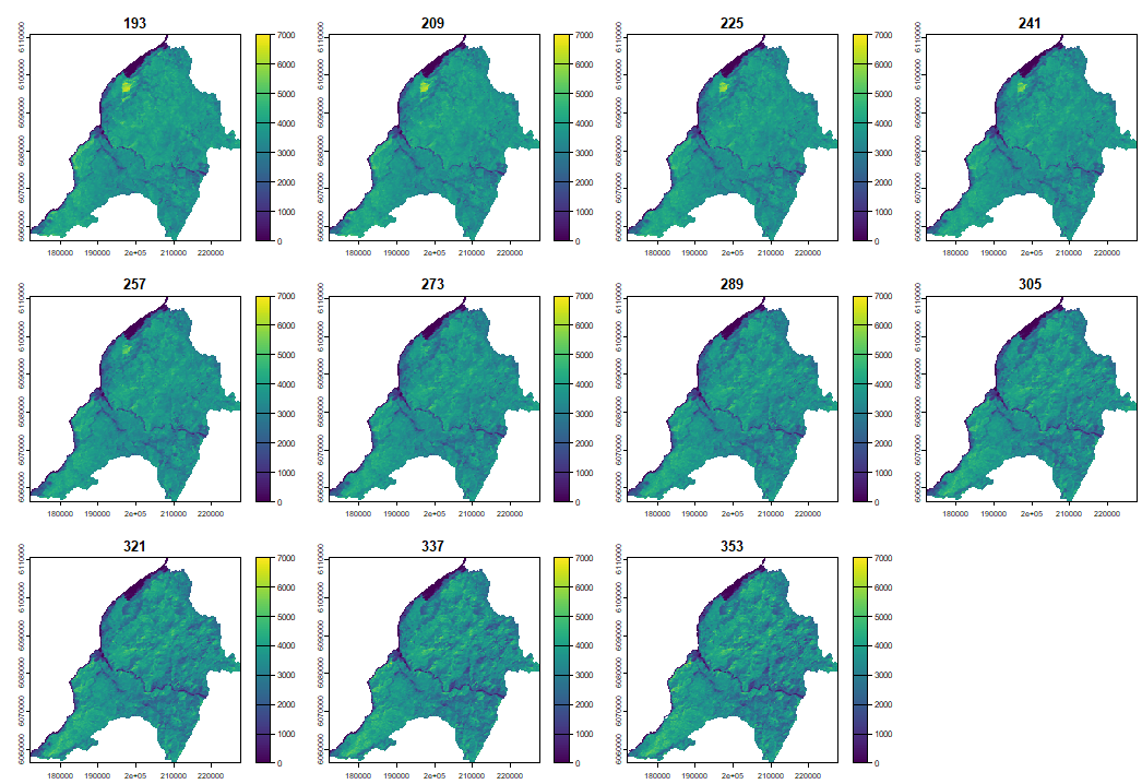
4.1 Reconstructing LSP with PhenMap
When plotting the phenological cycle we can clearly observe how the vegetation cover increases during summer and decreases during winter.
|
PhenMap(s = evi, dates = table_dates$date, h = 2, |

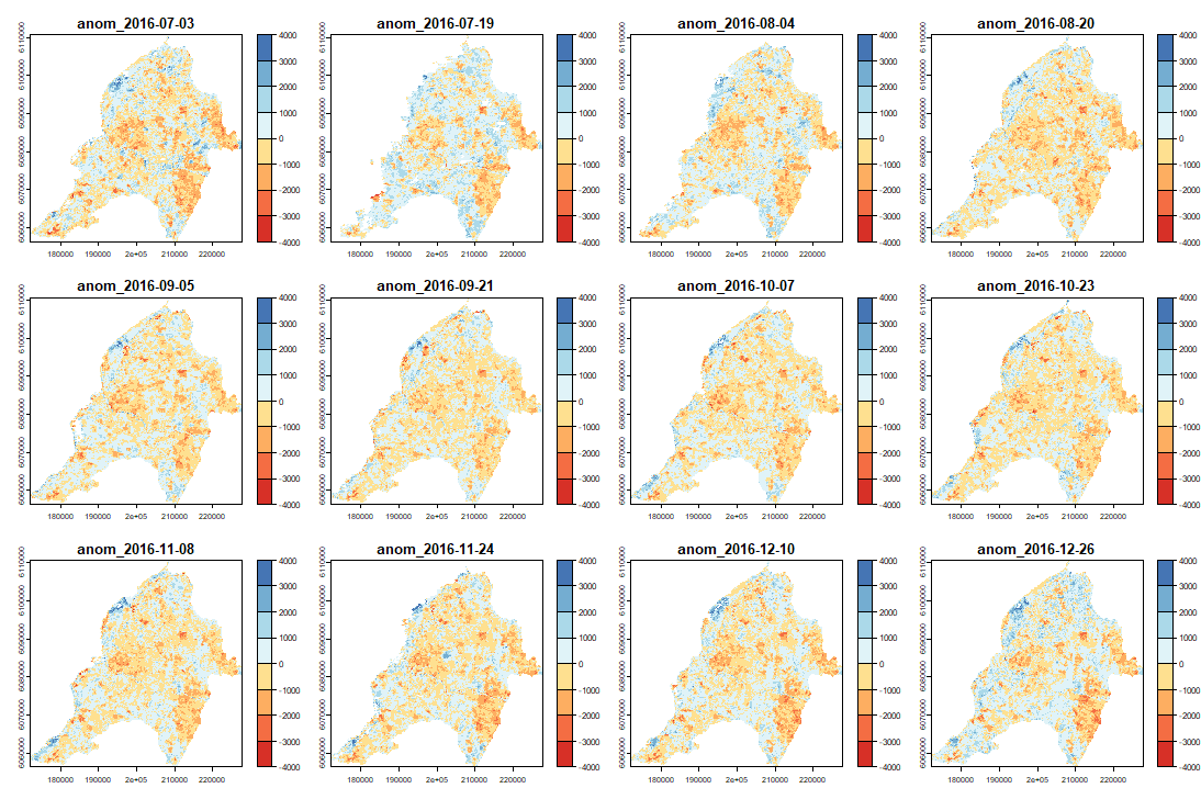
4.2 Anomaly detection using ExtremeAnoMap
ExtremeAnoMap() corresponds to ExtremeAnom() and can be applied to a time-series raster. We will use the same reference period (date #1 to date #196), and our anomaly period will be the growing season 2016-2017 ("2016-07-03" to "2017-06-18"; date #323 to date #345) to measure the extreme forest fire of summer 2017.
|
ExtremeAnoMap(s = evi, dates = table_dates$date, h = 2, |
Now we can map our anomalies (first half of the bands/layers)
|
anom.map <- rast('Anomalies_constitucion.tif') |

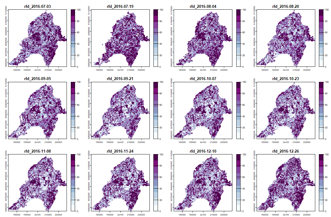
And its RFD for each date of "anop" (second half of the bands/layers)
|
anom.map <- rast('Anomalies_constitucion.tif') |

|
# Now with the output = clean |


- Descargas
-
 Demo data
-
 Demo table